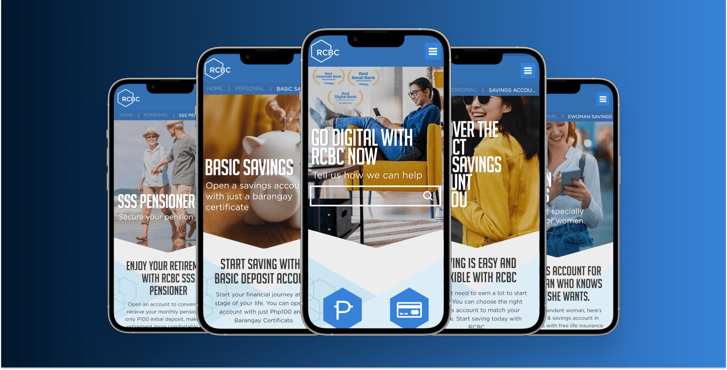
To gather data on how users interact with the mobile site, we conducted usability testing to understand what works, what doesn't, and the pain points users face in navigating and completing tasks. Through these tests, we identified areas of friction, such as complex navigation menus, slow load times, unclear calls to action, and the use of technical terms that users needed clarification on.
In addition, we performed a competitive audit to analyze each priority page and identify design shortcomings and areas needing minor improvements. After discovering these insights, a new wireframe and prototype were created, now in development.
By addressing these issues and optimizing the user journey on high-traffic pages, they seek to enhance conversion rates and overall user experience on their mobile platform.


